You be the Judge

W3rk

Chumono
Messages
606
Reaction score
901
Location
MD
USDA Zone
7a

Smoke

Ignore-Amus
Messages
11,668
Reaction score
20,727
Location
Fresno, CA
USDA Zone
9
I guess in a lot of ways I am crazy. I have spent a lot of money on stands, scrolls accent pieces, pots and accoutrements asscociated with the art of this kind of display. I also spent a really lot of money for Keido display books from Japan for the specific purpose of increasing my knowledge on this kind of display. To enter into a competition and try to use what one has learned not only from the teaching aids but also the past performances of 7 of these competitions and then have the rules of why we do it excused is not fair to the participants that are trying to excell. And for that,, I guess I am crazy. For me my past performance has been rendered useless in the persuit of excellence when the judging is going to be of this caliber. Something that started out so great has now been reduced to a club show. I wear the tiara proudly!!! Thank you.
 

justBonsai

Omono
Messages
1,442
Reaction score
2,595
Location
Arcadia, CA
Yes, by having the bonsai intrude over the edge of the scroll signifies that the bonsai is more important than the scroll.
Can the same effect be achieved by choice of the scroll as opposed to having the bonsai intrude over the edge? The displays feel very cluttered to me. Perhaps using a scroll like in 5 that doesn't have such a wide backing or perhaps in the painting itself like in 4 that uses softer lines and maybe is not so explicit on what it is depicting?


I don't know too much about displays yet, but here are my opinions purely based off how I feel.

I like 4 the most but I feel the strong color of the accent stand and the red pot contrasts too much from the soft color of the bonsai pot. Maybe too much contrast? Not exactly sure what the scroll is a painting of either--looks to be a bare branch under moon light? The display feels very clean but maybe lacks some cohesion.

6 has much better cohesion but the scroll feels too big? Maybe a scroll with a little color, nothing too bright will be better. Feels very dry and desaturated.

I like the combination of the accent and the scroll in 2, and after Mr. Nut's changes there's a lot less tension. The bright orange doesn't bother me anywhere as the tree looks to have fairly vibrant spring growth.
 

Bonsai Nut

Nuttier than your average Nut
Messages
12,480
Reaction score
28,132
Location
Charlotte area, North Carolina
USDA Zone
8a
I wear the tiara proudly!!! Thank you.

Did anyone at the show discuss judging criteria? Or was it just "assumed" that each judge would know what rules to follow? Certainly #5 doesn't have a bonsai, and #3 has major technical flaws that I tried to fix in my virt.

I assume #4 is yours, because technically it is the most correct.
 

Smoke

Ignore-Amus
Messages
11,668
Reaction score
20,727
Location
Fresno, CA
USDA Zone
9
Did anyone at the show discuss judging criteria? Or was it just "assumed" that each judge would know what rules to follow? Certainly #5 doesn't have a bonsai, and #3 has major technical flaws that I tried to fix in my virt.

I assume #4 is yours, because technically it is the most correct.
Can't discuss that right now. My attorney has advised me not to discuss that portion of the suit!

Yes 4 is mine and I built the stand in 3.
 

Smoke

Ignore-Amus
Messages
11,668
Reaction score
20,727
Location
Fresno, CA
USDA Zone
9
Can the same effect be achieved by choice of the scroll as opposed to having the bonsai intrude over the edge? The displays feel very cluttered to me. Perhaps using a scroll like in 5 that doesn't have such a wide backing or perhaps in the painting itself like in 4 that uses softer lines and maybe is not so explicit on what it is depicting?


I don't know too much about displays yet, but here are my opinions purely based off how I feel.

I like 4 the most but I feel the strong color of the accent stand and the red pot contrasts too much from the soft color of the bonsai pot. Maybe too much contrast? Not exactly sure what the scroll is a painting of either--looks to be a bare branch under moon light? The display feels very clean but maybe lacks some cohesion.

6 has much better cohesion but the scroll feels too big? Maybe a scroll with a little color, nothing too bright will be better. Feels very dry and desaturated.

I like the combination of the accent and the scroll in 2, and after Mr. Nut's changes there's a lot less tension. The bright orange doesn't bother me anywhere as the tree looks to have fairly vibrant spring growth.
Look at post 17
The pot is not red it is pink and the complimentary color to the teal blue of the stand. The scroll also exhibits some like colors in the bottom portion of the scroll. I felt this was about as much as I dare push the envelope on a western display using Japanese rules. I guess I was wrong, I haven't even scratched the surface I guess.
 

Smoke

Ignore-Amus
Messages
11,668
Reaction score
20,727
Location
Fresno, CA
USDA Zone
9
My scroll is that of Ume blooming at dusk. To be technical using that scroll on April 15 is about 45 days late. But it was the size I wanted being shorter, it had the colors in the scroll that worked well with the envelope pushing stand and it is just a cool scroll with the dusk moon.
 

justBonsai

Omono
Messages
1,442
Reaction score
2,595
Location
Arcadia, CA
Look at post 17
The pot is not red it is pink and the complimentary color to the teal blue of the stand. The scroll also exhibits some like colors in the bottom portion of the scroll. I felt this was about as much as I dare push the envelope on a western display using Japanese rules. I guess I was wrong, I haven't even scratched the surface I guess.
I do like the use of similar colors for the pot and scroll. Maybe on my phone the accent pot just looks dark but if it's a lighter shade like pink it probably looks better.
 

Smoke

Ignore-Amus
Messages
11,668
Reaction score
20,727
Location
Fresno, CA
USDA Zone
9
I do like the use of similar colors for the pot and scroll. Maybe on my phone the accent pot just looks dark but if it's a lighter shade like pink it probably looks better.
There was a discussion on this site about 6 months maybe longer ago about a guy looking for a pink pot. I found this one at the shohin convention from Garrett Ryan and thought I needed it. My new girfriend said if I didn't buy it she would. There is no way a woman is going to scarf a pot out from under my feet. Cash went down quickly. Pot by Bunzan.

DSC_0003.JPG
 

Adair M

Pinus Envy
Messages
14,402
Reaction score
34,898
Location
NEGeorgia
USDA Zone
7a
Can the same effect be achieved by choice of the scroll as opposed to having the bonsai intrude over the edge? The displays feel very cluttered to me. Perhaps using a scroll like in 5 that doesn't have such a wide backing or perhaps in the painting itself like in 4 that uses softer lines and maybe is not so explicit on what it is depicting?


I don't know too much about displays yet, but here are my opinions purely based off how I feel.

I like 4 the most but I feel the strong color of the accent stand and the red pot contrasts too much from the soft color of the bonsai pot. Maybe too much contrast? Not exactly sure what the scroll is a painting of either--looks to be a bare branch under moon light? The display feels very clean but maybe lacks some cohesion.

6 has much better cohesion but the scroll feels too big? Maybe a scroll with a little color, nothing too bright will be better. Feels very dry and desaturated.

I like the combination of the accent and the scroll in 2, and after Mr. Nut's changes there's a lot less tension. The bright orange doesn't bother me anywhere as the tree looks to have fairly vibrant spring growth.
When the bonsai “breaks the edge” of the scroll, it is supposed to only break the line of the edge, not the artwork itself.

There’s a couple of the displays where too much of the scroll is covered. And number 5 doesn’t seem to have contact!

@Smoke, I can identify with your pain. My daughter used to show horses. At the local club level, local, State and Region 4-H, as well as sanctioned American Quarter Horse shows. She would use the local shows as practice for the big ones.

At some local shows, we would get comments like: you horse’s tail is too full! Your outfit has too much bling! Your saddle has too much silver! Your horse’s coat is too shiny! Etc, etc...
 

CasAH

Chumono
Messages
780
Reaction score
1,270
Location
Arlington Heights, IL
USDA Zone
5
Al, I have never entered a show, but understand that Japanese judges prefer traditional displays. While some American and European judges do not necessarily follow the traditional judging rules. Can you say from where the judges were from? Such as Japan, Europe or the US?

The Midwest Bonsai Society’s Fall show this year will have a judge from Japan. The Society’s leadership has been reminding people that the person judging the show follows traditional Japanese rules, so prepare your trees and displays with this in mind.
 

Smoke

Ignore-Amus
Messages
11,668
Reaction score
20,727
Location
Fresno, CA
USDA Zone
9
Can you say from where the judges were from? Such as Japan, Europe or the US?

This made me chuckle, thanks for that....

Just a couple locals.....
 

Adair M

Pinus Envy
Messages
14,402
Reaction score
34,898
Location
NEGeorgia
USDA Zone
7a
This made me chuckle, thanks for that....

Just a couple locals.....
Hmm... maybe these judges really DO know what it is they’re supposed to be judging, and know that you’ve won this contest every year...

So they choose a completely gonzo display, on purpose, just to mess with you!
 

ERIKA

Yamadori
Messages
79
Reaction score
99
Location
Baguio City, Philippines
1st = #1
2nd= #3
3rd= #5

Photo #1 has a very natural look as if it has no human intervention and I love the accent plant which lends extra drama to the flight of the bat on the scroll...
Photo #3 is a very vivid expression of Spring....
Photo #5 gives the impression of continuity from the scroll down to the stone accent as a single landscape....
 

kakejiku

Chumono
Messages
654
Reaction score
484
Location
Salt Lake CIty Utah
Does everything in America need to be bigger? Given the size of these Toko 床, shohin bonsai would be much more easier to utilize in order to accentuate nagare 流れ (flow) in the displays.

Personal Critique of the Display #6
Most positive aspect of this display is the flow of the main tree.
1. I may be incorrect but this looks like a deciduous tree in a Moyougi styling. So this display would be categorized as a Gyou no Shin 行の真 (Semi-formal Planting with a formal styling)
2. If Gyou no Shin main tree, a Gyou no Shin pot (oval or square shape that is unglazed) would be more in line with traditional Japanese tastes
3. Scroll is too large and dominates the display rather than accenting the display. If this is to be a spring display....waterfall is typically a summer theme in Japanese culture.
4. Accent is a Sou 草 (Informal) item and the pot should also follow the informal nature Sou no Sou (round shape, glazed) Also, the most important point of the of the accent plant is to stop the flow. There is no discernable flow going back to the tree to provide that stopping point.

Some small things that could have been done to improve display as it is...
1. Move the table slightly further to the right and back to give more negative space
2. Rotate the accent 180 degrees to give the tall leaves pointing away from the display to point back towards the tree to provide a better stopping point for the flow (流れ)of the display.
3. Move the accent slightly more left to provide more negative space.
 

sorce

Nonsense Rascal
Messages
32,913
Reaction score
45,598
Location
Berwyn, Il
USDA Zone
6.2
This one is NEAR perfect but the foot on the pot makes it suitable for a left side.

This tree could have pretty safely been turned in this round pot.

These Tiny Details are the Most important IMO!

F that HUGE ass stand on the other.

Sorce
 

Attachments

  • IMG_2299 (2)1 copy.jpg
    IMG_2299 (2)1 copy.jpg
    123.2 KB · Views: 21

Cable

Omono
Messages
1,371
Reaction score
2,189
Location
Sheffield Village, Ohio
USDA Zone
6a
Dang, I miss ONE day and that's when all the fun happens. Well, I'm playing anyway!

Win: 3
Place: 2
Show: 4
 

Adair M

Pinus Envy
Messages
14,402
Reaction score
34,898
Location
NEGeorgia
USDA Zone
7a
This one is NEAR perfect but the foot on the pot makes it suitable for a left side.

This tree could have pretty safely been turned in this round pot.

These Tiny Details are the Most important IMO!

F that HUGE ass stand on the other.

Sorce
The foot of the pot is placed poorly. The foot should be in the center when the tree is in a round pot. If the pot is made so that it’s mostly “foot” on the bottom, and there are small cutouts to let water escape, one of the cutouts should be at the center.
 

kakejiku

Chumono
Messages
654
Reaction score
484
Location
Salt Lake CIty Utah
If this is the Toko Kazari event, I do not understand why one would be restricted from utilizing a Sanyasou 山野草 (Wild Grasses or Flowers) as the primary piece of your display. In fact, it would be more common to see a Toko no Ma decorated with an art object such as a vase, incense burner, or statuette than a bonsai or plant. But I digress...

Personal Critique of Display #5
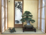
The strongest point of this display to me is how the planting is well planted, but still looks very wild. As if really untouched by man.

Using a Sanyasou 山野草 it is the most informal styling called Sou no Sou 草の草 in Japanese.
1. The Jiita for this is the correct shape (round), for the informal plant, but having such a high lacquered finish seems too formal for the main item.
2. The scroll proportion is very appropriate, and the scroll mounting in the informal styling (Sou no Sou) matches well. The color in the painting seems a little too distracting and I feel it would be better done with a monochromatic painting.
3. The puddlestone? (mizutame Ishi), which I can not tell if it is made of rock and natural or handmade ceramic, seems out of place and redundant. There already seems to be a river or pond in the painting. The ceramic jiita for this seems too large and the square shape does not seem to complement the main piece.

Things I would change to make the display better.
1. Of all the displays, this one would work best as a 2 point display in my opinion. I would remove the accent and utilize just the Sanyasou and the scroll.
2. Additionally, the negative space is not utilized in this display. Moving the planting to the right more would provide more balance to the display, with the natural flow of the planting going to the left which is also reiterated with the water flow in the painting.
 
Top Bottom