Paul,
I really like what you've done here. Literati is really difficult to do well, and you've got a great start going.
There are a couple of minor issues that bother me, if you don't mind discussing them. Please note, I'm only discussing what I can see in the photo. In person, the tree may look entirely different.
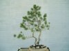
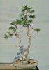
Most of my concerns are with the smaller tree. And, I realize it's just the first styling. But, there is a "crowded" area at the apex of the smaller tree. To my eye, the apex of the smaller tree appears to be fighting with branches of the taller tree for control of the space. Again, please realize that's what I see in the 2 dimensions of the photo. Literati trees are supposed to depict trees in the last stages of their life. Old, experienced trees, having survived decades if not centuries of battles with wind, snow, storms, etc. The control of the space where the second tree's apex is would have been decided decades ago. There should be no "fight" anymore.
And also with the small tree, I see some "rainbow shaped" branches. One really thin one stands out in particular. Maybe it's just a piece of wire, or a crack in the wall behind the tree. Whatever, those little details caught my eye, and they shouldn't. Which is why I'm bringing it to your attention.
But the overall image is wonderful, over the years as the trees get settled in it will evoke the timeless feeling of literati. Very well done, very well indeed.