You are using an out of date browser. It may not display this or other websites correctly.
You should upgrade or use an alternative browser.
You should upgrade or use an alternative browser.
Rock planting
- Thread starter Mike Page
- Start date
Attila Soos
Omono
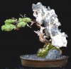
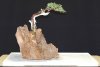
Interesting composition, Mike. I love the tree and I love the rock (reminds me of the front of a horse).
The tree and a horse seem to have some chemistry going, which is good.
On the other hand, the rock attracts a lot of my attention, it is as important as the tree itself. I am equally split between the two. Some people might say that they are "competing" for being the centerpiece, instead of "complementing" each other.
I am curious what others think.
Hi Attila
Your "horse" description is right on. I've called it "horsehead rock" for many years.
Regarding the rock attracting attention, that's what I expect as it's the principal component of the competition. You might even consider the tree to be an accent.
Mike
Your "horse" description is right on. I've called it "horsehead rock" for many years.
Regarding the rock attracting attention, that's what I expect as it's the principal component of the competition. You might even consider the tree to be an accent.
Mike
shohin kid
Shohin
Like the tree and rock combo. What I like about this bonsai is that it grabs my attention and makes me want to look at it more. It is a tree that I would remember. Lets talk about the rock, Where did you get a rock like that, was it imported or did you buy it in Japan? If you don't mind me asking, how much is a rock like that worth?
pjkatich
Chumono
Regarding the rock attracting attention, that's what I expect as it's the principal component of the competition. You might even consider the tree to be an accent.
Mike,
I concur with Attila, a very interesting and unique composition.
Based on your above explanation, I would consider using a different pot. To me, the pot (the color in particular) compliments the tree rather than the rock. To my eyes, this creates visual confusion.
In general, I think we have been conditioned to view a composition such as this with the tree as the focal point. As I look at your creation, my eye wants to move from the pot to the tree. However, due to the dynamic nature and color of the rock my eye is drawn away from the tree very quickly and this is were the confusion is created for me and the tree is lost.
I would select a textured, round pot with colors similar to the rock. I feel this would help the viewer to focus on the rock first and not cause as much visual confusion.
Just my thoughts.
Thanks for sharing.
Regards,
Paul
Attila Soos
Omono
Hi Attila
Your "horse" description is right on. I've called it "horsehead rock" for many years.
Regarding the rock attracting attention, that's what I expect as it's the principal component of the competition. You might even consider the tree to be an accent.
Mike
Right, one could also see the rock as the main attaction. But the tree still has a strong presence. Then again, one could say that neither the rock, nor the tree is the main attraction, but the rock-tree combined entity.
But if we look at them as ONE, than they must somehow flow together.... in this case, there is still a separation between the two, they don't really blend into one.
It is an intriguing piece, for sure.
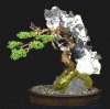
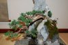
For some time I have been considering the relationship of the tree to the rock. Yesterday it came to me how I could accomplish the change I wanted with a minimum disturbance of the roots. It required cutting the wires securing the tree to the rock, removing some jin branches that were in the way of placing the tree where I wanted it to go. Then I was able to work the trunk around the horse's head and place it between the viewer and the head.
This process caused a cavity between the roots running down the rock to the pot. I filled this cavith with a mix of dark brown potters clay and rock. Guy wires were added from the upper tronk to the back of the rock furthur securing the tree. Lastly, fresh moss was added.
Today I did some trimming and branch wiring.
Mike
Attachments
Last edited:
Smoke
Ignore-Amus
This tree trimmed now as it is has a strong "clinging" presence with the rock. I feel as if this is a tree I might find along the way if I were a rock climber.
As it is composed, I am left wanting a larger...taller presence in the rock to give me that feeling more. Being nearly the same in height neither dominates the other and I feel that is what is missing.
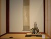
A similer attraction at the recent Kazari.
As it is composed, I am left wanting a larger...taller presence in the rock to give me that feeling more. Being nearly the same in height neither dominates the other and I feel that is what is missing.
A similer attraction at the recent Kazari.
Attachments
Attila Soos
Omono
For some time I have been considering the relationship of the tree to the rock. Yesterday it came to me how I could accomplish the change I wanted with a minimum disturbance of the roots. It required cutting the wires securing the tree to the rock, removing some jin branches that were in the way of placing the tree where I wanted it to go. Then I was able to work the trunk around the horse's head and p;ace it between the viewer and the head.
This process caused a cavity between the roots running down the rock to the pot. I filled this cavith with a mix of dark brown potters clay and rock. Guy wires were added from the upper tronk to the back of the rock furthur securing the tree. Lastly, fresh moss was added.
Today I did some trimming and branch wiring.
Mike
I like it better than the original one. There is more unity between tree and rock.
This tree trimmed now as it is has a strong "clinging" presence with the rock. I feel as if this is a tree I might find along the way if I were a rock climber.
As it is composed, I am left wanting a larger...taller presence in the rock to give me that feeling more. Being nearly the same in height neither dominates the other and I feel that is what is missing.
A similer attraction at the recent Kazari.
Al, one of my theories concerning landscape plantings is that you are only seeing a small part of it. The rest is up to your imagination.
Mike
Similar threads
- Replies
- 7
- Views
- 1K
- Replies
- 5
- Views
- 1K