You are using an out of date browser. It may not display this or other websites correctly.
You should upgrade or use an alternative browser.
You should upgrade or use an alternative browser.
2014 BIB Display planning
- Thread starter Eric Schrader
- Start date

Eric Schrader
Chumono
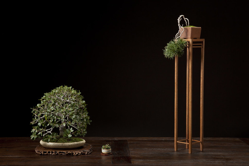
I didn't really have the time to change much in this display prior to the exhibit. Here it is as we shot it in the studio setup at the show:
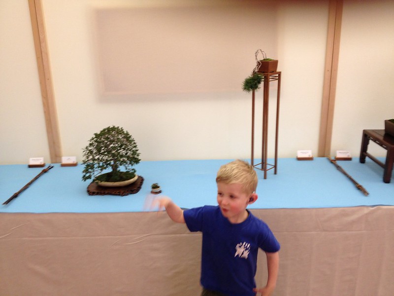
and with my crazy 3 year old son:
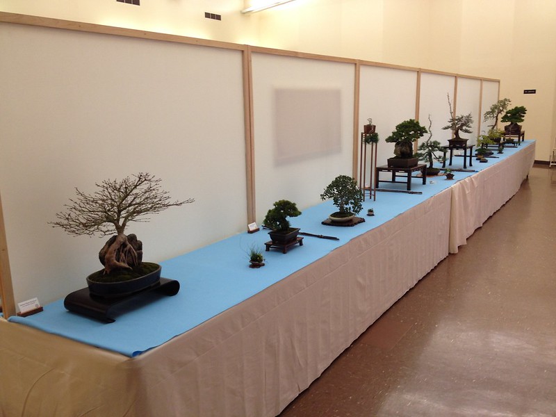
the row in the exhibit hall:
Cheers,
Eric
and with my crazy 3 year old son:
the row in the exhibit hall:
Cheers,
Eric
JudyB
Queen of the Nuts
Hi Eric, both your trees are wonderful, and have -and evoke much feeling. It is wonderful that progression of the oak.
And your 3 year old weed is a cutie!
What comments did you receive on the display if I could ask. I am always interested (although I don't always agree) with display critique.
I also think I like this display against the white background as opposed to the dark show photo. It works better for my eye. What are your thoughts on this?
Love the oak pot! I am wondering what the reasoning behind wanting a round for the pine...
Eric Schrader
Chumono
What comments did you receive on the display if I could ask. I am always interested (although I don't always agree) with display critique.
I had a lot of positive feedback on the pine in particular. People seemed to like the delicate nature of the tree. Bristlecones are not common as bonsai and I think that this one despite being very different from an ancient one still evokes some of the same feelings in viewers. I think this was a good show for the tree for two reasons: much of the audience is well-versed in traditional bonsai aesthetics and the show contains so many powerful trees that consequently a few wispy elegant ones really stand out.
I agree. We've shot the studio shots on pure black before, pure white, and also many times with a black background lit so that there is a lighter area in the middle. I don't prefer the black surrounding but for the single tree shots it can be quite dramatic. For the displays I think that white or medium grey or similar is clearly better for viewing. You can see a lot of the old show photos on the BIB website in the gallery section.I also think I like this display against the white background as opposed to the dark show photo. It works better for my eye. What are your thoughts on this?
Thanks, I really like the oak pot too. Ideally I would have preferred and American-made pot for this display, but the aesthetics of this pot won out in my mind.Love the oak pot! I am wondering what the reasoning behind wanting a round for the pine...
As for a round pot for the pine - I think that the pot it is in is nice, good texture and an unusual clay, but the tree is so delicate that I think the square shape is slightly too strong. It's not wrong in my mind, just something that might look slightly better or different. There is a particular style of round pot that I was looking for but I couldn't find one in the right size before the show. Changing the pot also would have meant changing the tall stand I think, perhaps to a root stand and putting the Oak on a stand with a more traditional table shape.
Cheers,
Eric
JudyB
Queen of the Nuts
Thank you Eric for your thoughtful replies. I feel like I have learned something from this thread, and your answers.

dick benbow
Omono
I agree that this has been a most excellent post to follow and apreciate all contributors.
Thank-you Eric, for getting this started and for Maples-san for contributing.
I would love to see more of this type of thread
Thank-you Eric, for getting this started and for Maples-san for contributing.
I would love to see more of this type of thread
dick benbow
Omono
I quess I do have some unanswered questions in the back of my mind that I would like your comments on ......
table cloth and it's light blue coloration? My senses tell me this has a water theme?
Coloration of oak pot and kusamono pot, basically a creme or white variation. Do they need to be strongly different color wise?
thanks
table cloth and it's light blue coloration? My senses tell me this has a water theme?
Coloration of oak pot and kusamono pot, basically a creme or white variation. Do they need to be strongly different color wise?
thanks
Eric Schrader
Chumono
table cloth and it's light blue coloration? My senses tell me this has a water theme?
I'm not sure. The simplest explanation for the table cloth color is that it matches what they use at Kokufu, which is I believe a strong motivation for Boon. The next simplest explanation is that it looks nice, calming, and doesn't visually interrupt the show. It's felt and is used throughout our exhibit. If you've seen photos of other shows in Japan you know that the color is not always blue; I've seen white and red at least.
Coloration of oak pot and kusamono pot, basically a creme or white variation. Do they need to be strongly different color wise?
Well, I think it's easy to over-complicate something like display. My opinion is that the "rules" are not really rules but more like enumeration of something that is difficult to put into words.
At BIB we study display every month at our meetings. The meetings are a lecture style with techniques for growing trees and styling. At the end of each meeting we set up a display or two and test different elements with the main tree to see how they feel and look. Often the height of the stand, the size of the accent, the texture of the accent etc are changed. Also up in the air are the arrangement of elements based on the visual flow of the trees and accent. What is set at that point is the pot that the tree is in.
So - I think the important thing to think about is how the display makes you feel. Is it thoughtful with diverse elements that work together and that "feel right?" In this case the oak's pot is quite old, and texturally compliments the tree while the accent plant pot is newer and in my opinion matches the youth of the plant well. The fact that they are similar color isn't an issue for me. But if it were an issue for someone else then a different accent could certainly be used. I'll admit that I was more concerned about the type of plant used and it's origin than the pot that it is in.
Another potential criticism via PM that came to me: the stand that the oak is on, a carved root round, and the stand that the accent are on are very similar. Perhaps it would be better to put the Oak on a taller root stand, or a stand that was more table-like.
If you've never seen a Kokufu album you might try to take a look, they contain many great examples of displays. You can gloss over the details if you're not careful, but there is a lot of good info in there.
Cheers,
Eric
dick benbow
Omono
Eric thanks for addressing my questions and for sharing your PM so the rest of us can continue to learn.
I'm so envious that you have an group that gets together and works with display monthly. What I would give....
I'm so envious that you have an group that gets together and works with display monthly. What I would give....
Similar threads
- Replies
- 21
- Views
- 7K
- Replies
- 1
- Views
- 2K